Turn fragmented operational data into decision-grade visibility
Data Visualization
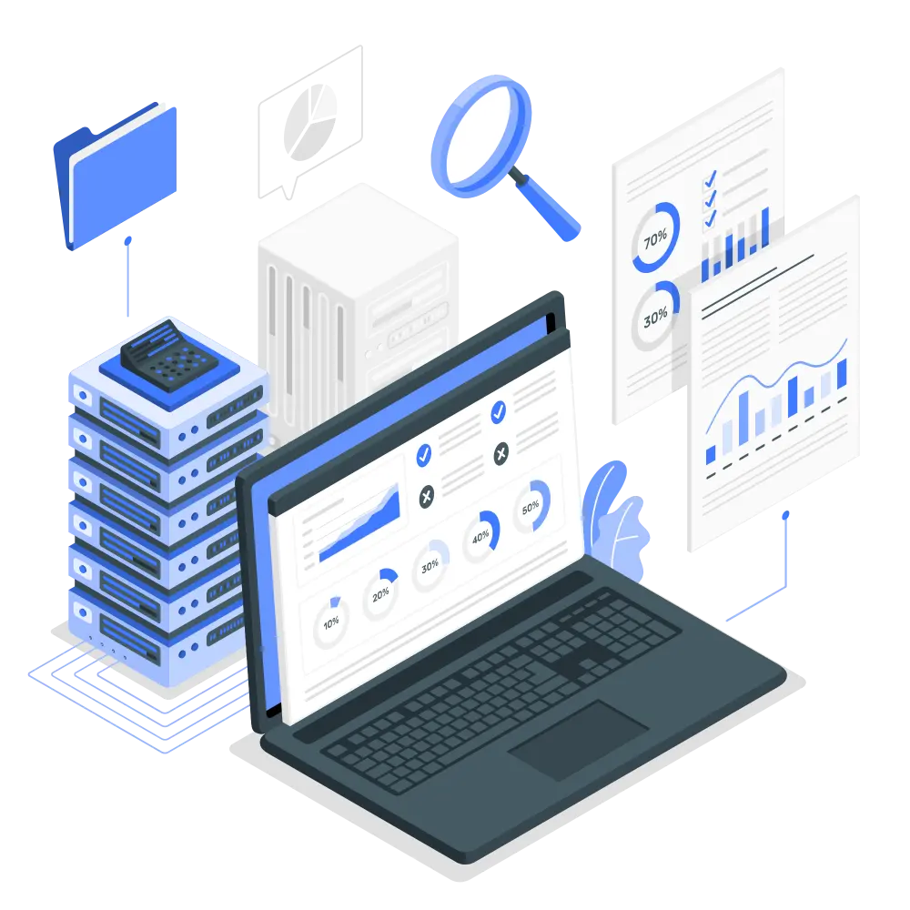
We engineer the full stack: data source integration, transformation pipelines, metric definition, and visualization layer. The result is a dashboard environment where the data is accurate, the metrics mean something, and the latency is appropriate to how decisions actually get made.

The data exists — the problem is it's not structured for decisions
Most organizations don't have a data shortage. They have a data accessibility problem: metrics are buried in operational systems, analysts spend hours on manual extraction and reconciliation, and by the time a report reaches a decision-maker it's already stale. We solve this by building a stable data layer — source integrations, transformation logic, metric definitions — that sits beneath a visualization interface designed around how your stakeholders actually consume information.
You have the data — but it's not driving decisions
Visualization failures are rarely about the charts. They're about the data underneath: unreliable pipelines, undefined metrics, missing integration between source systems, and refresh rates that don't match decision cadence.
Data is siloed across systems with no integration layer
Revenue, operations, and customer data live in separate systems. Any cross-functional report requires manual extraction and reconciliation — a half-day process that produces a snapshot already hours out of date.
Report latency doesn't match decision cadence
Daily operations need hourly data. Monthly reviews need daily granularity. When reports arrive on a fixed schedule regardless of operational urgency, managers make reactive decisions based on stale context.
Charts are present but insight is absent
Dashboards full of metrics that nobody can act on. The wrong dimensions, missing drill-down capability, and no clear signal when something requires attention. Visual noise substituting for operational visibility.
Report production is a recurring manual process
A team member spends hours each week exporting data, reformatting it, and rebuilding the same charts. Errors creep in. Time that should be spent on analysis goes to data wrangling.
Different roles need fundamentally different data views
Executives want trend lines. Operations wants drill-through to individual transactions. Finance wants categorized rollups. A single report satisfying all three serves none of them well.
Metric definitions are contested across departments
The same KPI produces different numbers in the sales system and the finance system. Inter-departmental alignment is impossible when the source of truth is disputed before the meeting starts.

Stable data layer first — visualization second
We build a reliable transformation and serving layer before designing a single chart. Metrics are defined, source-of-truth is established, and refresh latency is matched to operational requirements. The visualization layer is the last step.
Multi-source integration with unified data model
Source connectors for each operational system, transformation logic that reconciles inconsistencies, and a unified data model that gives every metric a single authoritative definition. Manual reconciliation eliminated.
Refresh rate matched to decision cadence
Real-time streaming for operational dashboards that drive immediate action. Scheduled batch pipelines for analytical views where freshness requirements are measured in hours or days. Architecture selected per use case.
Drill-through from summary to source record
Aggregated KPIs link to dimensional breakdowns, which link to underlying transactions. When a metric moves unexpectedly, the answer is two clicks away — not another query request to the data team.
Metric design before visualization design
We work with domain owners to define what matters and at what granularity before building any chart. The result is a dashboard where every element exists because someone needs to act on it.
Automated report distribution
Scheduled reports delivered by email or messaging platform on defined cadences. Recipients receive accurate, current data without manual intervention.
Role-based access and data governance
Data access scoped by role. Sensitive data masked or excluded based on viewer entitlements. Audit log of data access where compliance requires it.
Data layer before visualization layer
Visualization projects fail when they're treated as frontend projects. We start with data architecture and work up to the interface.
Stakeholder interviews & metric definition
Structured sessions with domain owners to identify which metrics drive decisions and at what granularity. Output: a metric catalogue with business definitions, owners, and data source mapping.
Stakeholder interviews & metric definition
Structured sessions with domain owners to identify which metrics drive decisions and at what granularity. Output: a metric catalogue with business definitions, owners, and data source mapping.
Data source audit & integration design
Inventory of all relevant data sources, assessment of data quality and refresh capability, and design of integration and transformation architecture.
Data source audit & integration design
Inventory of all relevant data sources, assessment of data quality and refresh capability, and design of integration and transformation architecture.
Data model & transformation development
Data warehouse or serving layer implemented. Transformation logic encoding metric definitions built and tested against known-good reference data.
Data model & transformation development
Data warehouse or serving layer implemented. Transformation logic encoding metric definitions built and tested against known-good reference data.
Visualization prototype & UX review
Prototype dashboards built and reviewed with end users before final implementation. Layout, chart types, and interaction patterns validated against actual consumption workflows.
Visualization prototype & UX review
Prototype dashboards built and reviewed with end users before final implementation. Layout, chart types, and interaction patterns validated against actual consumption workflows.
Build & integration testing
Production dashboards built, connected to live data pipelines, and tested for accuracy, performance, and access control correctness.
Build & integration testing
Production dashboards built, connected to live data pipelines, and tested for accuracy, performance, and access control correctness.
Launch & continuous improvement
Post-launch metric review and user feedback collection. Dashboard evolution tracked against changing business requirements.
Launch & continuous improvement
Post-launch metric review and user feedback collection. Dashboard evolution tracked against changing business requirements.
Common deployment patterns
Data visualization applies wherever operational data needs to be consolidated and made accessible to decision-makers.
Executive dashboards
Company-wide KPI visibility for senior leadership — revenue, operations, and risk metrics on a single interface, accessible across devices.
Operational control rooms
Real-time operational status displays for campus, factory, or command-center environments — designed for large-format screens and continuous monitoring.
Departmental reporting automation
Sales, finance, and operations reports generated automatically and distributed on schedule — eliminating recurring manual data processing.
Customer-facing data products
Queryable views of relevant data exposed to external clients or partners as part of a service offering.
Supply chain & inventory visibility
Inventory levels, inbound shipments, and order fulfillment status consolidated in real time. Threshold breaches trigger alerts before stockouts or overstock situations materialize.
Workforce & performance analytics
Headcount distribution, attendance, and performance data aggregated for management review — supporting workforce planning and performance management decisions.
Why Metavun
We combine data engineering depth with visualization design — the result is accurate data presented in a way that drives actual decisions.
Data engineering, not just dashboard tooling
We fix the data layer before touching the UI. If the source data is wrong or the metric definition is ambiguous, the most sophisticated visualization is still wrong.
Metric design before chart design
We help you define which metrics matter for which decisions before building anything. Dashboards that result from this process are used — not ignored.
Private deployment supported
Data platform deployable entirely within your network perimeter. No SaaS dependency for sensitive operational or financial data.
Post-launch evolution support
Business requirements change. We support ongoing dashboard iteration as metric requirements evolve and new data sources come online.
Metric calculation logic is auditable
Every metric has a documented definition, a traceable data lineage, and a designated owner. Inter-departmental disputes over metric values have a resolution path — the authoritative definition.
Embeddable visualization components
Visualization components can be embedded in existing business systems via iframe or SDK — surfacing data inside the workflow where decisions are made, rather than requiring context switching to a separate analytics tool.
Who we build for
Organizations with meaningful data accumulation but insufficient tooling to extract operational value from it.
Mid-to-large enterprises
Business data distributed across multiple systems. Management needs consolidated visibility without a permanent data engineering headcount.
Manufacturing & industrial
Production data, equipment status, and quality metrics need real-time monitoring and trend analysis to support operational decisions.
Government & campus operators
Multi-domain operational data consolidated onto a unified platform supporting command-and-control and performance accountability.
Retail & e-commerce
Sales velocity, inventory levels, and customer behavior metrics tracked in real time to support merchandising and operations decisions.
Operations-intensive businesses
Daily operations require real-time visibility into a dense set of KPIs. Management decisions are only as good as the data latency allows.
Data-driven technology companies
Product metrics, user behavior, and A/B test results require a unified analytics platform that supports rapid iteration decisions without bottlenecking the data team.
Core Technology Stack
Stack selection is driven by data volume, latency requirements, and whether custom UI or BI tooling better serves the use case.


Let's Build Something Great Together
Whether you need a custom AI solution, legacy system modernization, or a production-grade data pipeline — we’re ready to scope, architect, and deliver.
Contact Us